Nat Botanicals | Visual Identity Design
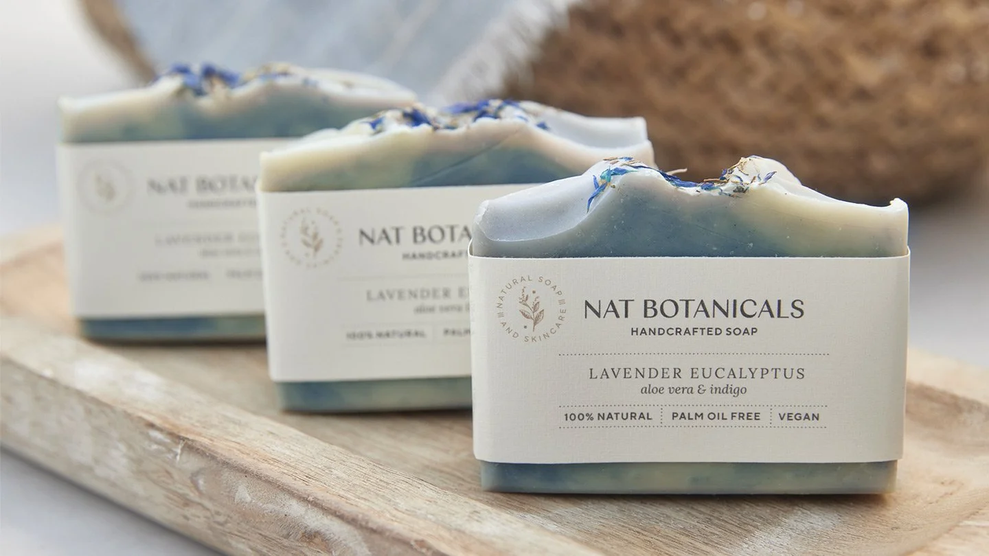
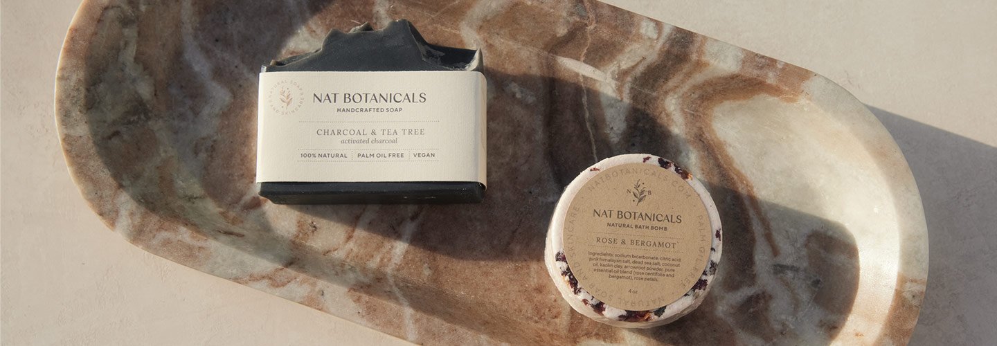
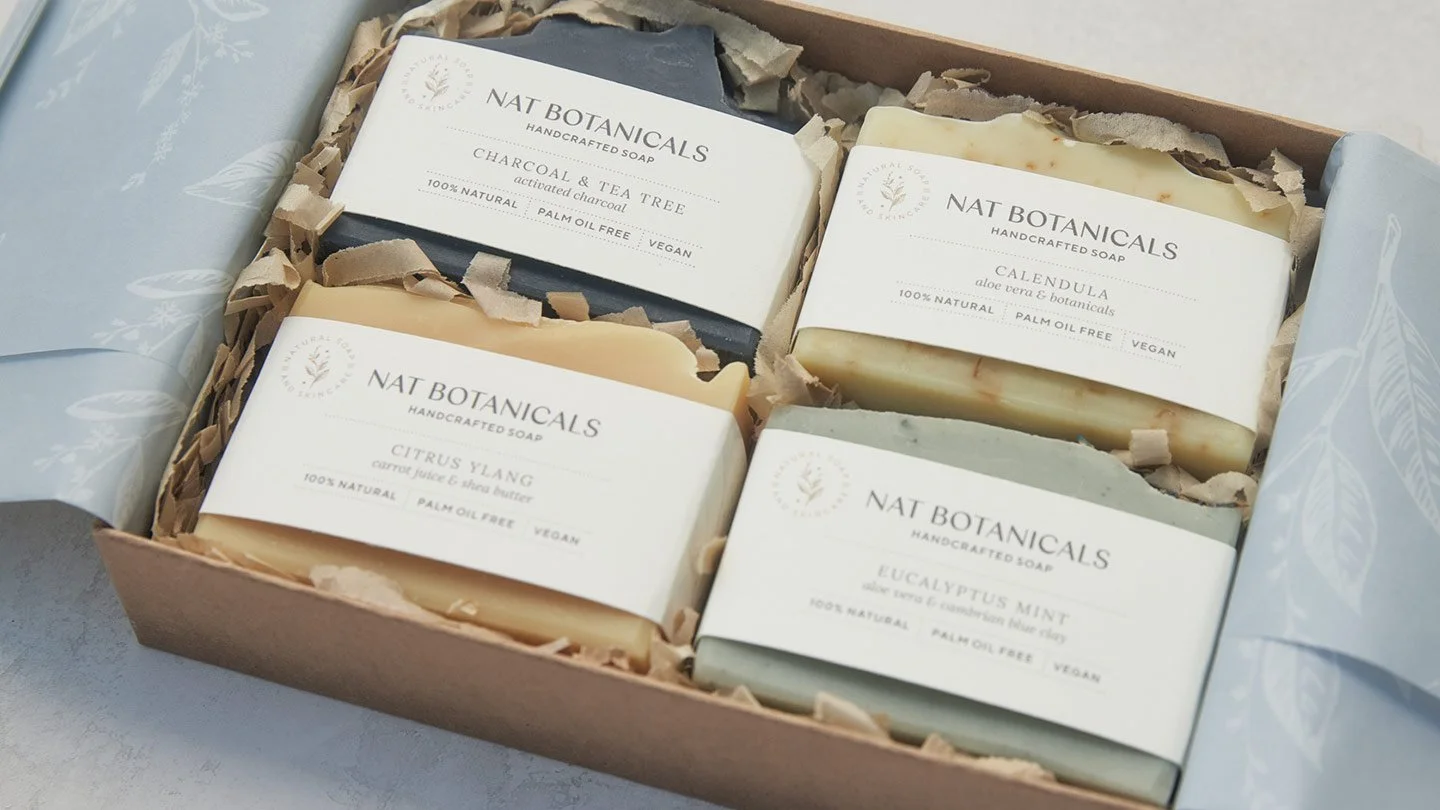
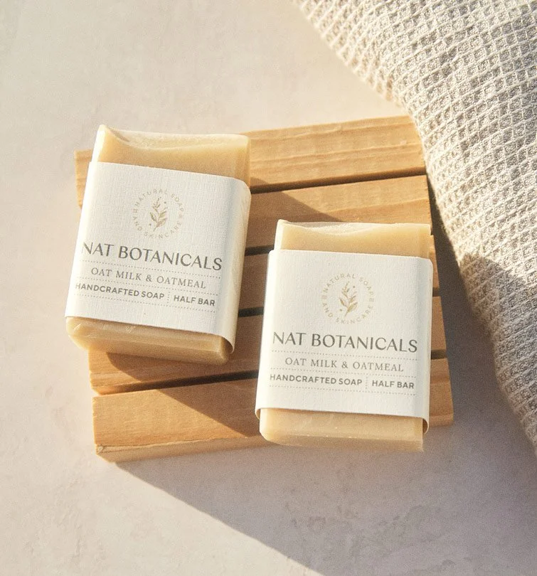
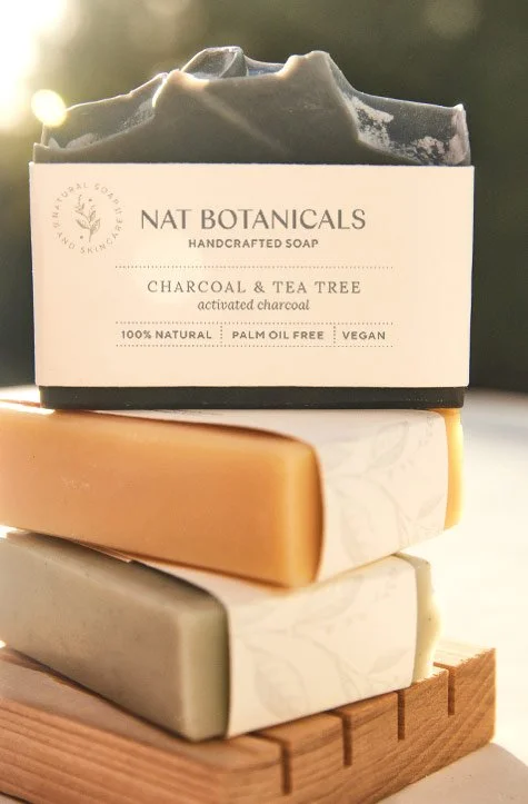
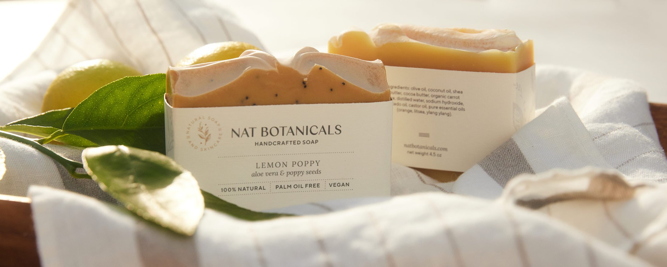
Nat Botanicals is a line of handcrafted soap and skincare that is free of toxins, synthetic fragrances and artificial preservatives. Their products are also free of palm oil, due to its environmental impact. I had the exciting opportunity to fully refresh the brand’s visual identity and develop new product packaging.
Objectives for the new identity and packaging:
Strike a balance that feels laid back, yet fresh - earthy, yet elegant
Draw upon the founder’s upbringing in coastal France and early adulthood spent in Southern California
Appeal to a refined, eco-conscious demographic
Reflect the brand’s commitment to sustainability
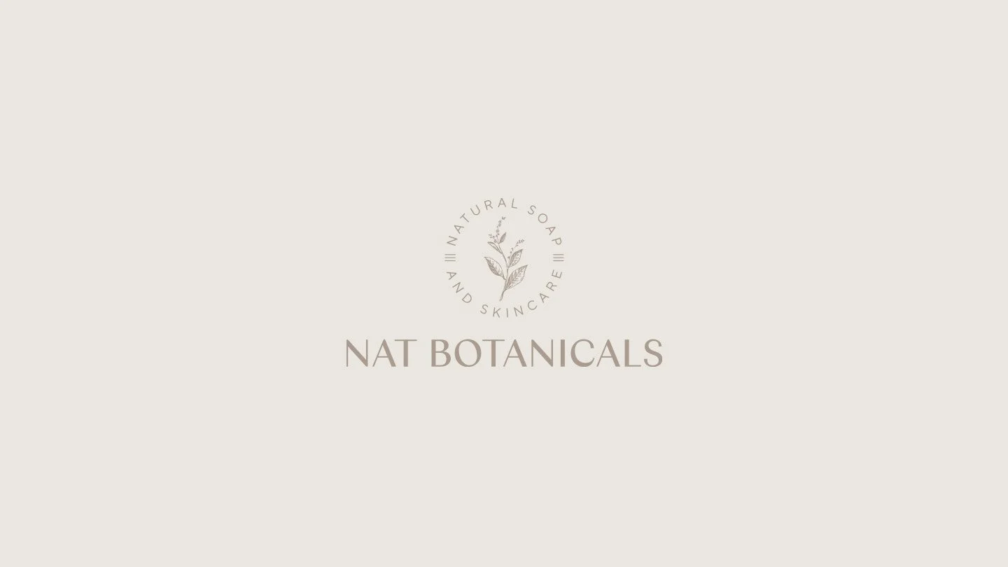
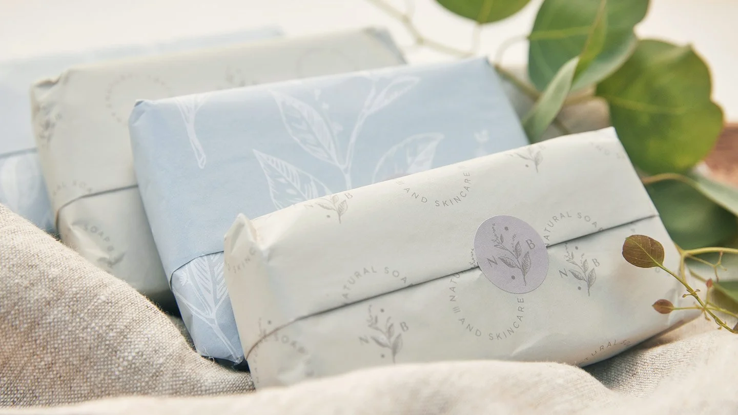
With these objectives in mind, I created an etched style botanical illustration to anchor the identity and evoke the artisanal, pure ethos of the brand, with some stripes added as a subtle nod to Natacha’s French roots. The brand palette was inspired by the sun-weathered Provence landscape and used selectively to give the colorful soaps center stage. Packaging was also designed to be minimal and fully recyclable, with the tissue paper & stickers printed in soy based ink on FSC-certified, acid-free paper.
Client: Nat Botanicals
Scope: Identity Design, Packaging, Art Direction